 [Image: Central European Forum, Olomouc, by Šépka Architekti].
I'm a fan of this strangely megalithic museum and cultural center made from a series of concrete shells, colored white with crushed marble, proposed for the Czech city of Olomouc.
According to the designers, Šépka Architekti, the project "attempts to draw inspiration from both... a small scale of mediaeval subdivision of land on the one hand and the large scale of palaces, ecclesiastical and military buildings of the Předhradí beginning here on the other."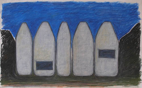 [Image: Sketch of the Central European Forum, Olomouc, by Šépka Architekti, looking vaguely like an inverted, institutional-scale variation on Neil Denari's Useful and Agreeable House].
The museum is divided into five apparently separate but linked buildings; this is due to "the necessary separation of the individual functions of the exhibition halls, library, entry hall or bookshop and refreshments," a "necessary separation" that also generates a convenient spatial identity for the overall project.
One of the coolest things about the design, though, is what Šépka Architekti call their "house in a house" idea, inspired by access to indirect sunlight: "Even in the cases when an upper floor is inserted in an individual building, daylight is ensured on the lower floor through placement of a smaller structure. We thus approach the topic of a ‘house in a house’, which ensures favourable conditions for the the display of exhibits on the walls while providing light from above on both floors."
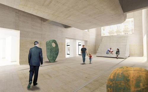
You can see the formal implications of this in the below image, where a massive, seemingly hovering trapezoid acts both as another, elevated room for gallery use and as a massive, light-filtering device for the skylights further above.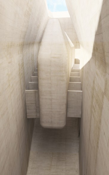 [Image: Central European Forum, Olomouc, by Šépka Architekti].
It's a mass that casts shadows inside the building.
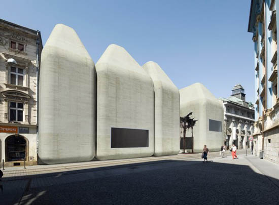
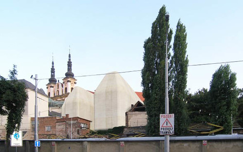
Provided the exterior concrete ages well, the museum's fivefold street presence—briefly stepping back at one point to form a public plaza—is actually pretty stunning. It manages to allude to design languages as diverse as Neo-Brutalism, the Romanesque, a kind of Tatooine Moderne, and computer harddrive casings (although I'm reminded of Owen Hatherley's recent quip about "a modernised classicism, monumental yet free in details, that usually gets subsumed under the meaningless retrospective coinage 'art deco'"—here, we might say, "modern geometries, imposing in size, built from concrete, and thus subsumed under the meaningless retrospective coinage 'Neo-Brutalism'").

 [Image: Central European Forum, Olomouc, by Šépka Architekti].
The results are quite beautiful in profile, even when simply rising up behind the walls of neighboring buildings.
In any case, the interior volumes also lend themselves well to defining an overall spatial experience, even while departing from one another just enough to keep each bay or gallery distinct. 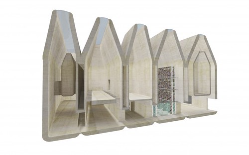
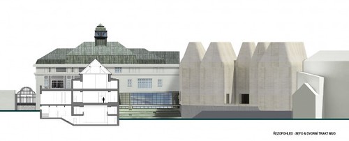
 [Image: Central European Forum, Olomouc, by Šépka Architekti].
As mentioned earlier, that interior is a mix of art galleries, a library, a bookshop/cafe, performance spaces, and, oddly enough, as if Photoshopped in simply to prove a point, a basketball court. Note that the stadium seating visible in many of these images has been mounted on rails for ease of rearrangement.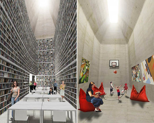


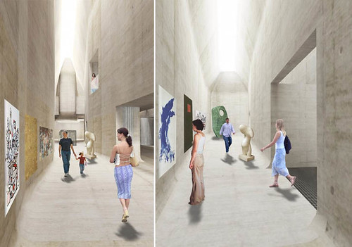
 [Image: Central European Forum, Olomouc, by Šépka Architekti].
In plan, it's interesting to remember that the separate units of the building here were generated from what Šépka Architekti referred to as the "small scale of mediaeval subdivision of land." In other words, the buildings take their formal cue—at least abstractly—from ancient real estate divisions on the ground in Olomouc, not from some overzealous application of the architects' own stylized form of site analysis. 

 [Image: Central European Forum, Olomouc, by Šépka Architekti].
The complete building, seen in slices: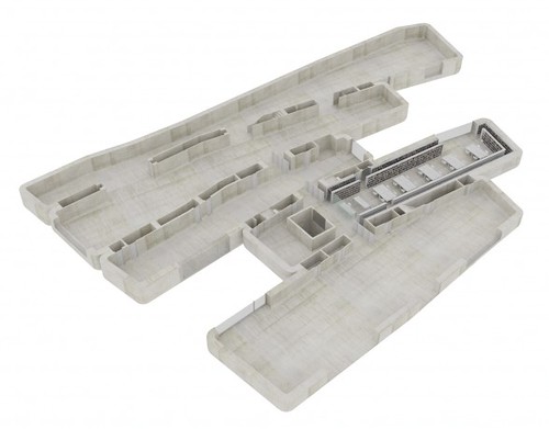

 [Image: Central European Forum, Olomouc, by Šépka Architekti].
Further, the "small scale of mediaeval subdivision of land" that I've mentioned three times now also means that what could very easily be an imposing, alien monolith made from smooth white concrete, stuck irresponsibly in the center of the city, actually manages to be appropriate in scale.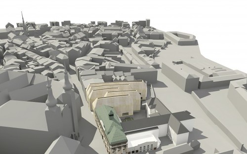
 [Image: Central European Forum, Olomouc, by Šépka Architekti].
The building hasn't been constructed, of course, and we have no real idea how the concrete will age; but I was struck by the images from the instant I saw them, flipping through a back issue of a10 yesterday afternoon.
Check out more images courtesy of Šépka Architekti.
Lưu trữ Blog
-
▼
2010
(3068)
-
▼
tháng 6
(251)
- Burns vs. Slusarski
- Western lynx spider
- Ding Dong, Doorbell Moth!
- Caterpillar troubles
- 9.7.
- Flooded London 2030
- Conditions Report - June 30 2010
- Austria is different
- Guest Post - A not-so Carrie Bradshaw moment
- Känslor
- Böcker
- Painting around this year's finches
- Porch light spiderlings
- Attack of the destroyers
- Baby Origami - Fold that Baby for Free!
- Well I didn’t think of this one
- Western States 2010
- House-in-a-House Museum
- Frostbite Symptoms and Treatment
- Lång dag
- And here comes the Fun Police...........
- Rat Bait Falls from Helicopter onto Kakapo Island
- Något nytt, något rött och något skogigt
- I love the smell of napalm in the morning
- Top-Managed Belays
- Portable Lensed Microcosms Looking Down Into a Fro...
- The Out-of-Towner
- The Perception of Value
- Hello MummyDiaries!
- Jag kan springa!
- July and August Climbing Events
- World Cup USA Party
- Onion Rings
- Peanut Butter Cupcakes with Peanut Butter Swiss Me...
- Playlist - 26th June 2010
- Bortkopplad
- Zale caterpillar?
- What will this turn into?
- Unknown moth
- Laying down flat
- The best size of spider
- Weak Pull: 2010 Topps Oliver Perez
- What will they say about Julia?
- Cave of Kelpius
- Tails up!
- Freshly shed
- You can't see me
- Nobody can be uncheered by a ladybug.
- Weekend Warrior - Videos to get your Stoked.
- I know I promised - but
- iridescent wings
- Double Edition of Saturdays with Saw Hole.
- Image Concrète
- A Design History of Military Airspace
- How Good is that Bolt?
- Trevlig midsommar!
- Money Saving + False Economy + Benefit Giveaway!
- Mysteries of Life
- Beware the Badger's Curse (and Friday Quiz)
- Lunch in The City: June 21-25
- Climbing and Outdoor News from Here and Abroad - 6...
- Tremor
- Australia has a new Prime Minister and she’s a woman!
- Al Rosen to Gregg Jefferies: I heart your stink
- Memo from Mrs Woog
- Apple on a pedestal
- Glass & te
- Conditions Report - June 23 2010
- Från storstan ut på landet
- A Letter To Myself.
- The Baseball Card Blog welcomes a new writer: Mike...
- Is this the worst (best) dive in history?
- The Meadowlands
- WAVVES - KING OF THE BEACH
- The Munter-Mule
- Family Mines and the Basement Zoning Codes of Minn...
- HERZOG - SEARCH
- CRYSTAL CASTLES - CELESTICA
- Cupcake Club: London Bloggers Meetup
- Fuskare
- The Gift that keeps on Taking
- UIAA Responds to Everest Age Restrictions
- The worst film I have ever seen
- It Sucks!
- A WS100 Scouting Report
- Subterranean Builders' Guide
- The Super-Munter
- An exercise in humility
- Week Ending June 20 (WS - 6 days)
- Crypto-Forestry and the Return of the Repressed
- The "star thing that holds the summer"
- Because I got an email tonight...
- Vanilla & Honey Macarons
- Housewife burned in rissoles incident
- PHOTOGRAPHY BY LUKASZ WIERZBOWSKI
- June and July Climbing Events
- The Truth Behind the Snuggie (+ GIVEAWAY!)
- Taste of London 2010
- Playlist - 19th June - 2010
- Latest work
-
▼
tháng 6
(251)