Hurray! For the first time since 2005, at least two fertile Kakapo eggs have been laid for this year's breeding season. Scoop.co.nz has the exciting news. It feels like such a long time since I was able to report such news, and this blog was less than a year old at the time.

The breeding season of New Zealand’s most endangered bird, the kakapo, is off to a great start with at least two fertile eggs laid on Codfish Island and two female birds, previously thought to be too young, also laying eggs.

Conservation Minister Steve Chadwick says these are the first eggs laid by kakapo in three years, and it is hugely exciting that two six-year-old kakapo have laid eggs, because we previously thought the minimum breeding age was nine years.


Down in Gisborne, New Zealand, there is an exhibition going on called "Famous Faces 2" which features a profile of Don Merton. Don was the saviour of the Chatham Island black robin, and is a man who has done so much good work towards saving the Kakapo Parrot from extinction.

It is a joint venture between the Pride in Gisborne Trust and Tairawhiti Museum.

Following up on a successful exhibition of 29 personalities from the Gisborne and East Coast district in 2002, the latest exhibition is 21 additional -- but just as worthy -- profiles, said museum curator Dudley Meadows, who is also a Pride in Gisborne trustee.
The Gisborne Herald had the story back in January, but the exhibition continues through the end of March.


Chester Zoo's Komodo Dragon Flora as welcomed another baby male to the world, and once again there was no daddy to be found. It's parthenogenesis at work again. The Wirral Globe has the story.

Kevin Buley, Chester Zoo's Head of Zoo Programmes, said: "The absence of a strong male partner really doesn't seem to trouble Flora. She remains determined to do her own sweet thing with fantastic results."
advertisement

Flora's solitary existence, however, is going to be short-lived and in a few months time she will finally get to cosy up with dragon Norman who has made his home at Chester.
The story also goes on to say that visitor numbers have gone up quite sharply, which they're attributing to David Attenborough's TV series "Life In Cold Blood".
The start of the new BBC One series Life in Cold Blood has reawakened an enthusiasm for reptiles and amphibians and some of Chester Zoo's cold-blooded inhabitants have received many visitors during half term.

More than 50,000 visitors have passed through the gates already this month and February looks set to be one of the busiest in the zoo's 74-year history.


Maybe 'eagles' isn't so accurate. 'Slightly ruffled exhausted-looking pigeons' is probably a truer description. My family has arrived in New Zealand for a visit, and as I stood at the gate waiting for them to disembark their final flight (London to Singapore -12 hours; Singapore to Auckland -12 hours; Auckland to Wellington -1 hour) I was struck by how utterly bizarre it is to welcome one's


Yesterday, I saw this damaged and possibly dead monarch chrysalis that looked as if the milkweed bug was feeding on it.


I found this big, squirmy crane fly larva in the soil yesterday while I was pulling some weeds. I tried to take still pictures of it, but the darned thing wouldn't hold still. So I tried video mode.

It reminded me of an elephant seal. Or maybe an elephant's trunk. Only much smaller, and yuckier. After I finished filming it, I did what I figured was a practical thing: I fed it to my female wide-arm mantid. I will not post those pictures here, because it was horrible and gross. The maggot practically exploded with dark fluids. The mantid slurped up every drop. *gag* (sorry!)

Click here to see an adult crane fly in a previous post.


Check out my latest comic book 'I heart Paris',
an exclusive preview on my blog:

http://www.champagnecatfight.blogspot.com/

See you there?


Platform Florida This Saturday, starts @ 6:00pm.. Hope to see you guys there......


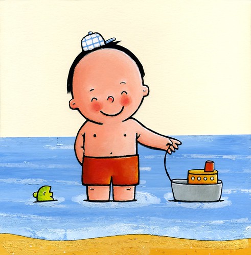
I'm making a series of toddlerbooks for Clavisbooks.com (Sea-Garden-Pets). These are the first scans.
The books will be released in the summer in Belgium and The Netherlands. Have a closer look on Flickr!


Thanks to Paul Andinach for this tip about ABC Radio National Australia's feature on conservation efforts in New Zealand, which includes an interview with conservationist Ron Moorhouse about the Kakapo. A more complete version of the interview was also separately broadcast a few days later.

Both are available from the ABC web site as streaming audio or
podcast:

Feature:
http://www.abc.net.au/rn/scienceshow/features/2008/balancingnature/newzealand.htm

Interview:
http://www.abc.net.au/rn/inconversation/stories/2008/2166359.htm

Thanks Paul.


Here's a fantastic mantis-themed bento created by Sakurako Kitsa.
Bento is a Japanese lunch, packed in a compartmentalized box. I remember when I worked for Hitachi many years ago, the recently transplanted Japanese employees would bring their neat little divider boxes packed by their dutiful wives with rice in one section and something else, maybe scrambled egg, vegetable, (or something I couldn't quite identify!) in the others. The lunches always looked so nice and, well, orderly.

In the 20-or-so years since I left Hitachi, the whole concept of Bento boxes pretty much dropped from my radar screen. Now, thanks to the miracle of the internet, I have learned that Bento has evolved into an artform. And Sakurako is a master. Just have a look at her Bento set on Flickr. In fact, I almost wasn't sure whether I should post this here on Bug Safari, or on my Art Blog. But it is a mantis after all, and mantids belong right here.


This faux stained-glass portrait of Barack Obama was comissioned by the Volkskrant. I kinda liked the way it turned out and thought I'd share it with you guys.


No need to get political, just read the image....


I already put them on my own blog, but here you can see them a little larger if you click on them. Our own dear Evert commented:
It's really great. (Thank you Evert) Reminds me of mon épouse Dominique waking up in the middle of the night.
However, your lady has a very short left leg. The foot of her her right leg, with bended knee, should be much closer to the body. Or rather: her left foot should be further away from her.
I replied:
I know! I thought nobody would notice, because they're hidden underneath the sheet. I know how it happened too. I made a reference photo, my daughter under a sheet. And then I made that knee a lot higher because it looked nice with the elbow. Two angles, enfin. I noticed the difference in leg length, but I thought whatever.


Audio

ONRA - Chinoiseries (Arkhonia Re-Seq) (Label Rouge)
LIKHAN' - Terre (7even)
PEVERELIST - Infinity Is Now (Tectonic)
JOHN FAIRHURST - Joys Of Spring (Humble Soul)
CATH & PHIL TYLER - Wether's Skin (No-Fi)
SAMAMIDON - Fall On My Knees (Bedroom Community)
FIRE ON FIRE - Liberty Unknown (Young God)
T.LA ROCK - Back To Burn (Fresh)
BOVILL - Low Pressure (Meanwhile)
CLARO INTELECTO - Harsh Reality (Modern Love)
BYETONE - Plastic Star (Raster Noton)
RUSSELL BROTHERS - The Party Scene (Portrait)
JACASZEK - Rytm To Niesmiertelnosc I (Miasmah)
AARON MARTIN - Sisters (Preservation)
JONNY GREENWOOD - Oil (Nonesuch)
NEWCLEUS - Computer Age (Push The Button) (Sunnyview)
KARLHEINZ STOCKHAUSEN - Kontakte (Excerpt) (Stockhausen Verlag)
EDGARDO CANTON - Animal Animal (Nepless)
VERNON ELLIOT ENSEMBLE - Ivor The Engine Theme (Trunk)
JOHN PFEIFFER - Reflection Of A String (Victrola/Creel Pone)
LORQ DAMON - Journey Backwards (Tala/Creel Pone)


Boot camp begins in a week. I'm a bit nervous now that my neighbor, a veteran boot camper, has told me that I am "crazy" for joining in the same month that Steph is due. At least the Rabbi has decided to join me in the pain that will be coming my way...


About two weeks ago I was on the floor petting Java. There he was, lying on his back, all four legs up in the air, when I noticed a large mass in his abdomen, just beneath the rib cage. He's a lumpy old man full of little, harmless tumors called lipomas. This one felt very different. It was larger than any of the others and it appeared to be in his abdomen, not on it. Not good.

Last Friday we saw our vet who took blood, urine and x-rays. The vet confirmed that there is a large mass of unknown origin in his abdomen and referred us to a specialty clinic for a more thorough diagnosis. Of course, all I could think of is that he has a terminal disease or something that would reduce his quality of life, making last weekend quite unhappy in our house.

On Tuesday we went to the vet at Georgia Veterinary Specialists. After more blood work, an ultrasound and aspirating the lump, it turns out to be nothing more than another lipoma. Cheers all around, Java is a healthy old man after all! And now he has a very expensive funny haircut - shaved belly with very uneven edges - to show off to all the ladies...

Java, its time for you to get a job and start paying some of the bills around here! Maybe you can tour with the Black Eyed Peas singing about your lumps. ("My lumps, my lumps, my big ol' fatty lumps... check it out!")

· Java


Yes, I can feel your stares on the back of my neck. And I’m ready for the comments expressing your incredulity at my not including this set in the top 20 of the early decade. First ’93 Upper Deck and now this? This one even has an A-Rod rookie! What, exactly, are you smoking?

Yes, 1994 SP was one of a handful of sets to including an Alex Rodriguez rookie card. Actually, it had four of them, plus a special autographed version available through Upper Deck Authenticated. But this is not the A-Rod Countdown, so I’ve approached sets with Rodriguez rookies like I did a few years back with those sets with Canseco, Clemens, Bonds and other hobby titan rookies (nice company, eh Alex?). This hasn’t been done to spread my personal dislike of Rodriguez, but because sets have to be rated objectively. Maybe you don’t agree with my rankings (and wait till you see who made the top ten!). That’s fine; let’s open the debate. I’m not doing this countdown to make friends (or really enemies, for that matter).

1994 SP was a beauty of a set. The cards weren’t the first to be printed on metallic stock, but they were the first to silhouette the players in such a way that they appeared grounded in reality, not floating through some Lawnmower Man alternative dimension. They were little pieces of gold, and packs were insanely expensive for the time (and today. Have you tried buying a pack? Forget it. It will probably run you $20 or more, and I’m guessing that it will keep going up as Rodriguez races towards the career home run mark).

I only bought one pack of these when they came out, and even though I got mostly commons—though check out the Delgado die-cut; yeahhh boy-eee—I coveted them like they were the treasure of the Sierra Madre.

But so what? As Upper Deck’s answer to the Finest and Leaf brands, SP may have been the popular choice as 1994’s king of the premiums, but that wasn’t exactly a tall order: Topps Finest couldn’t rebottle the magic of its debut set in 1993 and Leaf/Limited wasn’t that great (though it too had a Rodriguez rookie on its checklist). And besides, SP was the hot shit second fiddle to Topps Finest in 1993. That Upper Deck’s competitive fire was enough to turn the tables on Topps in 1994 was almost to be expected. That’s the way things work.

I’m not trying to come across as downplaying a set of SP’s caliber, but I… ah forget it. Call this set #17. Dammitt… now I have to rethink my top twenty.


Its friday and I know a lot of you guys will be doing a little bit of drinking....I know I will have a few. One drink I will not be having is Wild Turkey! I had my first shot of Wild Turkey about four years ago at a wedding I was shooting. I don't usually drink when I'm shooting weddings, but I was with the groomsmen, and the groom was an older man, tuff guy,a real jack ass. Well he is taking shots of Wild Turkey and I'm taking pictures of this and he pours me one and says, "Hey photodude, suck this down!" I said ok sir I wasn't going to say no. I was kind of scared, he would pull out his knife that was on his hip and gut me like a turkey.......So if you see a guy in a tux with a big ass pocket knife on his hip.....run, i tell you run!


I've loved solo travel ever since my first trip across Europe a decade ago. Its sense of freedom and endless possibilities are the rarest gifts, and I find it difficult to give those up to travel with others for long.

Unfortunately, there are days when trudging alone grinds you down. Whether it's the petty uncertainties from being perpetually uprooted, or facing dinner on your own (yet again!), the challenges are always present. Then there are the more difficult moments, the emotional events that come on without warning and leave you limping and lurching through whatever city you're in at the time. It was on that note, and a heavy heart, that I started the sunset climb of the Lion's Head yesterday afternoon.

The Lion's Head is a jagged 669m guardian of rock overlooking Cape Town from a seat directly in front of Table Mountain. The peak thrusts clear from the brush and low trees on its flanks and to form a sentinel watching over the city's Atlantic suburbs and downtown core. It's stunning.

The hike is meant to last two hours, and I started out at twenty after five with the sun still pounding out of the clear blue sky. I was caught without sunblock again, as usual forgetting the relentless burn of the sun at these latitudes until it's all but sunk behind the horizon. But it was beautiful and fresh. The trail circled around the peak, bringing every corner of the city into view one after another before cutting up in a vertical chain climb to the final ascent. All in, it was about thirty minutes and several photo stops before I was crossing the summit to find a comfortable spot for to await the setting sun.

Immediately in front of me was the cold Atlantic and the Clifton and Camps Bay suburbs clinging to the slim line of coast. On the right the smaller peak of Signal Hill stood watch over my current home in Sea Point, and behind me spread the downtown core of the City Bowl nestled into the flanks of Table Mountain. It was a stunning and virtually private panorama until shortly after six when the summit started filling up. The company was nice, and the crowd grew to cover every open space without taking away from the quiet of the surroundings or the sound of my thoughts.

It's amazing how wrong you can get things, how incomplete your own version of the truth can be, and how blind you can be to the right way of simply being with things, most of all with yourself. You try to live from that place, but no matter how well you think you understand, you end up feeling like you need some sort of answer. Sometimes its moments like these.

The sun began its final descent behind the clouds and sea, and as it did the answer to a question I had only whispered rushed in. What a beautiful simplicity, and how terrifyingly easy it is to miss. It's as if you're capable of accepting anything in the world, except what's in your own heart, and sometimes you just need a place like this where you can be quiet for long enough and remember.

A few moments later the sun disappeared and eyes turned exactly 180 degrees to look out across the opposite face, for not only was this the rising of the full moon, it was also a lunar eclipse. The moon broke the horizon over City Bowl and the Sun and Moon embraced its creation, the Earth, in arms reaching from either end of the cosmos, touching every corner of our world and in doing so touching everyone I love.

I spent some time in that place and gave thanks for all the gifts of the day before beginning the trip down. It was time for a burger, and a beer.


Hi there. I’m Gary Sheffield. I was just pomading my phat-ass Kid’N’Play hi-top fade. If you're wondering how I keep it so perfectly coiffed... well, let’s just say a couple drops of flaxseed oil under the tongue helps.


This is one of the most underrated sets of the early decade in terms of design and on-card content (as opposed to checklist, which was mostly a dud). 1992 saw Studio incorporate a warmly lit color headshot (less Herb Ritts and more… stock photography? The creativity of the headshot photography in this set was a little suspect) set against a larger black and white action photo. Its border design bears a strong resemblance to the same year’s Gold Edition from Leaf, though in its inverse (large gold border highlighted by a thin black frame). The thin gloss coat makes the colors pop on the front and shows off a classy ‘Studio’ watermark on the back.

Like the other Studio sets, what really gave this set oomph was the biographical data it gave on the back. While not as punchy as, say, 1992-93 Skybox basketball, the Studio sets provided more than enough unintentionally hilarious information. For a lesson in the power of juxtaposition, look no further than Paul Molitor: Intense Individual:

Hobbies are golf and racquetball… Favorite singer is Bruce Springsteen; actor is Robert De Niro; movie is Silence of the Lambs; book is the Bible.

…can you imagine being roommates with him on the road? Yikes.

All right, so this set is ranked probably a little too high. But tell me, why am I a sucker for Senior Superlative sets? Were the other brands really that boring by comparison? It’s fascinating that a brand like Studio could survive more than one or two years, and yet it effortlessly transcended its novelty status in 1991 to a real set, with real cards—produced every year—that carried weight in the Hobby almost until the end of the decade (the last Studio set was released in 1998). The brand even gave the Hobby one of its most memorable insert sets of the early decade in Heritage (debuting in this 1992 edition).

I should amend my thoughts at the beginning of this review. This set isn’t underrated: it has a weak base checklist and the design—while quality—is about on par with other sets one step up from the manufacturers’ respective flagships. What this set is is surprising. Surprising in that it’s surprising that it was made, surprising that the hobby, while reveling in its own bloated-ness, could float a set like this for more than just a year, and surprising that as a brand Studio flourished for eight years, mostly on the combined strengths of the emotional angle of the cards and the one, excellent insert set.


While other kids my age were busy doing whippets under the bleachers after school, I was at home, in my room, by myself, blowing my mind with the three-photo cards found in 1992 Upper Deck. Upper Deck debuted the gimmick in 1989, but it was hardly old hat three years later. I mean, did you hear me? Three photos on one card! And they all overlapped! The concept rocked then, and it still rocks today (I’ve stared at this card of Ken Griffey, Jr. now for at least five minutes straight and still can’t figure out if I’m looking at three or four overlapped photos).

With cards like these stealing the spotlight, you almost forget that 1992 Upper Deck had all the hallmarks of a great set: a fantastic design, memorable rookies, fun subsets and a checklist that didn’t turn anybody away at the door. Toss in a bizarre (yet timely) insert of Tom “Mr. Baseball” Selleck, an autographed Ted Williams Hero(es) Worship card and enough holograms to start your own hall of mirrors and you were looking at probably the best set Upper Deck had assembled up to that point. Taking nothing away from its landmark inaugural set from 1989, 1992 Upper Deck was great simply because it didn’t look cheap, with its bright colors, inviting graphics and thinly glossed stock, even though it was.

And that’s an important distinction to make. 1989 wasn’t a cheap set to buy into, even though it probably should have been: the cards, while totally revolutionary at the time, have not aged very well (outside of the Griffey rookie and two or three others). They feel flimsy, with dull, muted colors and photography that doesn’t jump as far off the page as it probably should, given the set’s stature in the hobby. But cards from 1992? Perhaps because it was never going to be (or intended to be) considered a Pillar of the Hobby-type set, it hasn’t had as far to fall. My argument’s coming out all convoluted, but the gist is that because 1990 Upper Deck missed out on one of the biggest rookies of the year (Frank Thomas) and 1991’s design can best be described as ‘eye-gougingly painful,’ the expectations for 1992’s set were very low. Obviously, Upper Deck learned from the previous two years’ mistakes and had a few tricks up their sleeves, but if anything the set’s goal seemed to have some fun out there. And it passed with flying colors (not to mention with a stash of three-photo motion cards).

I should probably also mention something about the ill-advised Comic Ball 3 set, as it featured much of the same design as 1992 Upper Deck. All I can say is that the Upper Deck writers must’ve been on something more potent than junior high-strength whippets in order to come up with coherent dialogue between Jim Abbott and the Tasmanian Devil. I mean, writing for Reggie Jackson and Daffy Duck is easy: they’re both obsessed with themselves. But Jim Abbott and Taz? First, I thought Taz could only shriek nonsense, and second, I didn’t realize Jim Abbott had enough personality to carry a conversation, much less one with a cartoon character.


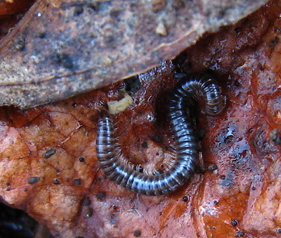
I just realized it's been over a week since I posted anything here, (although I did post a nice set of pictures of my wide-arm mantid female on Flickr.)The weather has been cool and cloudy/rainy. I haven't really been looking for bugs too much. I do have these 2 things that were under a log in my yard.


A cute little millipede


A big, ugly spider. This a "sowbug killer". Looks to be a pregnant female.


It's not always easy to take a picture of these kinds of bugs that live under logs, rocks, etc. I have to lift the log up with one hand and be ready to take the picture with the other. The bugs usually scurry away pretty quickly once they realize they've been exposed. Earwigs have been especially problematic because they move really fast. I've been trying to get a good picture of a momma earwig and her babies, but they always disperse too fast, and the pictures are always blurry. I'll keep trying though. It'll give you something to look forward to.


I don’t know if you’ve noticed, but lately I’ve been writing up a storm. There’s a reason: I’m moving and will have only limited access to a computer next week. Besides, I’ve made you wait long enough for more of the Nineties Countdown, right?


I should come right and say it: I was a Score Man in the early Nineties. After what I thought were ugly 1988 and 1989 sets, there was little the flagship could do wrong over the next five years (divided into two distinct parts: the free wheeling, massive mass-consumption trilogy from 1990 to 1992, and the more refined, scaled-back and grown-up sets from 1993 and 1994). That’s quite remarkable, especially for an era when the best description for the majority of sets was ‘treacherous.’

Score put the behemoths to bed in style: a futuristic base card design complemented by a handful of subsets (including the benchmark ‘Dream Team’), plus decent inserts, special factory set cards and a checklist of roughly six billion (alright, that’s a stretch, but I’m not off by much). And the best part of it all? It was easy to collect. Packs were cheap and if by 1992 putting together a set through packs wasn’t really your thing (and who can blame you, what with all the high-dollar inserts making pack buying more of a lavish exercise rather than a necessity), you could saunter down to your local drugstore and buy the whole factory set.

And the trick of it was that Score knew their sets were gigantic and that collectors would want a factory set option. Hell, they even encouraged such thinking amongst the rank and file (I bought the factory set from 1990 to 1992). Why else would they have included all those attractive factory set inserts (Cooperstown, DiMaggio, Yaz, World Series)? It was as if they were saying that the only thing you’d get from buying packs (besides possibly completing the set) was pack fatigue.

But the thing about buying the factory set that sort of ruined the experience was that you couldn't enjoy each card. A lot of kids I knew didn't even take the cards out of the box once they got it home. Not me. I dumped the set out and fully incorporated it with the rest of my collection. Today I still I have the empty factory set box, but damned if I know where its contents are.

And this was a set that was meant to be thumbed through, you know? Out of 893 base cards, there were 60 denoted subset cards (including the crazy, Cool World-esque mind-bending cartoons-in-the-real-world All Stars) and at least 141 rookies and top prospect cards. That's a quarter of the set right there. That most of them didn't pan out (or their 1992 Score incarnation wasn't their real rookie) hardly mattered in the end. Overall, a glorious, gluttonous set.


While the countless other brands fought tooth and nail for a foothold in the hobby, GlamorShots, excuse me, Studio was the only set with a truly unique position: showcase the players as well-rounded individuals. And do so on great-looking cards. Instead of re-inventing the wheel each and every year, all they had to do was pull down a different backdrop: 1991 saw the classic charcoal, 1992 had a close up on a craquelure newspaper photo and 1993 gave us jersey detail. All that was missing was the hand-on-chin pose in front of the bookcase and soft-focus lighting on stars in the night sky.

For Studio, baseball was just window-dressing. The real focus was the emotional side of each player. From Curt Schilling: Hobbies are golf, war gaming and military history… Might have been a history teacher if he hadn’t been an athlete. And from Robin Yount: Hobbies are golf, motorcycles, cars and fishing… Might have been in professional racing if he hadn’t been a baseball player.

The key to this set was that players had lives off the field (who knew Curt Schilling liked to play Risk?), and were somewhat normal human beings with normal, everyday dreams. Robin Yount wanted to be the next Richard Petty? Me too. It’s the ‘me too’ aspect that takes down the wall between player and fan and endears them to us (damn you, psychological window dressing!).


MP3 players and IPods at the ready! Stephen Fry has released his first podcast (or "Podgram" as he calls it) and it is entitled "Broken Arm". In it he describes how he broke his arm filming the Last Chance To See TV series in the Amazon. It seems that boats are the problem, and he broke his arm getting INTO a boat, whereas Douglas Adams had trouble getting OUT of a boat on Round Island during recording of the original radio series. Stephen certainly came off worse though, as his x-rays show.

Subscribe and download the episode from here: Stephen Fry's Podgrams

Thanks to ZZ9's DaveH for the tip


Haven't posted here in a while. Here's some monster heads I've been working on recently.
Will come back and post more stuff soon.


I was going through the Rp Polaroid Archives located in Auburndale, Florida. And I'm not one to brag but damn their are some good ones. I wonder if they found good homes? I did find this one, it never got posted here on the World Wide Rapidview Blogspot. As some of you know I have a sitemeter on my blog now to see how many hits I"m getting....Let me tell ya its HUGE! Ha, My buddy calls me and tells me that I'm getting hits way over in Kuwait.. I thought that was so cool..Somebody over there checking out my blog or trying to learn about Polaroid.....well this Polaroid is for you my Kuwaiti friend.....


If we remove the overt references to astrology, 1992 Leaf is the baseball card equivalent to the premise of The Fish That Saved Pittsburgh. Struggling brand/team that nobody wants? Check. Hare-brained schemes crazy enough they just might work? Check.

All right, the comparison is a bit of a stretch, but let’s step back for a moment and take stock of where Leaf was heading into 1992.

With its spectacular mix of winning design, hot-ticket rookies and limited availability, Leaf’s re-birth from Canadian Donruss to full-bodied super-premium set was the talk of the hobby in 1990. On the heels of that unbridled success, something happened that should have been avoided, but also probably expected: 1991 Leaf was a bloated, ugly mess, not only devoid of rookies within the base set, but released in such mass quantities that it pushed the brand from thoroughbred to laughingstock overnight.

Faced with the harsh reality that nobody really looked to their product for hobby gold anymore, the company did something interesting. While other brands added scores of new bells and whistles to make their products stand out, Leaf managed to give their set relevance again by adding only one: the Gold Edition parallel. By simply seeding one gorgeous gold-foil-on-black-border card per pack, Leaf was back. Oh sure, it helped that 1992’s design was cleaner than the hideous cards from the previous year, but a parallel set was something entirely new at the time*, and no set had done black borders since 1987 Donruss, a design motif that added a certain emotional weight to the card.

Was 1992 Leaf a great set? Not really (it wasn’t ever really a powerhouse set). But what it lacked in pizzazz it more than made up for with a clean design and simple, forward-thinking inserts.


*1992 also saw the introduction of Topps Gold, though those were harder to find than Leaf’s one per pack. Leaf’s 1992 Gold Edition would be the brand's only base set parallel until 1996’s Press Proofs set.


I’ve always liked this set. Actually… how I feel towards this set goes a little deeper than just liking it. I like like this set (if you know what I mean). Is that embarrassing? Perhaps. But let’s just say that were I invited to Upper Deck’s house for a party in the basement and we just happened to play spin the bottle, and when I spun it just by chance pointed in 1993’s direction, well, let’s just say that I wouldn’t be against spending five minutes in the laundry room with the set. Alone.

Why? C’mon, do you even have to go there? Okay. Fine, I’ll tell you—but you have to promise me you won’t tell anyone. And don’t expect me to make eye contact with you while I tell you this.

It’s because I’ve never felt ashamed of the fact that I bought the factory set and paid full retail price (at least $40 at the time). It’s because it was probably the best-designed Upper Deck set from their first five years (1989 to 1994). And yes, that includes both 1993 and 1994 SP.

It’s because 1993 saw Upper Deck fall in love with gold metallic ink, resulting in the super-attractive Top Prospects design, as well as the script player name (first use of script since 1990 Donruss) on the base card front. That script on the front was classy, especially when combined with the thick white borders, the warm, vibrant photography and the sheen of the UV gloss. And because it was classy, I was classy for appreciating it, elevating me from pimply, 14-year-old introvert to discerning Man Of The World.

But beyond design, I love the little things: the Peter Gammons ‘Inside the Numbers’ subset, the obvious Score/Pinnacle rip-off inserts like ‘Then & Now’ and the Iooss Collection, not to mention the unparalleled ‘Teammates’ subset, like this one of the Texas Rangers’ ‘Latin Stars.’ (Quite a group, eh? Also, Juan Gonzalez’s hand on Palmeiro’s shoulder kind of creeps me out.) Topps has tried to bring back this kind of subset with their ‘Classic Combos’ incarnation, but no subset since 1993 has outdone ‘Teammates.’ It’s definitely one of Upper Deck’s greatest contributions to the hobby.

Finally, I love this set because it’s Upper Deck like we’ve never seen it before: quietly putting out a great, no-real-frills set, the bombast of previous years replaced by a quality checklist and a great design.


Half a moon ago, Cowboy and I were invited to a Corporate Box experience at a sporting event known as the IRB Rugby Sevens. The Sevens is an international rugby tournament, with seven players a side and seven minutes each half. It's only remotely like normal 15-a-side rugby. Still, the sense of adopted-national pride runs deep and besides, a whole afternoon and evening of watching fit men run


February 11th marked the 18th anniversary of Nelson Mandela's long walk to freedom. I missed the opportunity to make a commemorative post on that event, but hopefully I can make up for it by sharing an equally important, though less known, story of apartheid - the story of District Six.

District Six was established adjacent to the downtown core in 1867 as the "Sixth Municipal District of Cape Town" – a mixed community of freed slaves, merchants, artisans, labourers and immigrants. Over the next century the modest area grew into a cosmopolitan melting pot boasting a rich jazz scene. Later, as the dark years of apartheid clamped down on the city, it became a haven for musicians, writers and politicians looking for a moment of escape. In the words of legendary South African jazz pianist Abdullah Ibrahim, District Six was a "fantastic city within a city. Where you felt the fist of apartheid, it was the valve to release some of that pressure."

However, by the mid sixties the government had the community in its sights. In 1966, after allowing the area's infrastructure to crumble for years, the government classified District Six a slum and declared it a 'whites only' area under the infamous Groups Area Act. Forced removals began two years later and by 1982 sixty thousand people had been relocated to the Cape Flats township some 25 kms away. District Six was razed to the ground and, despite having once been home to a tenth of Cape Town's population, the area remains barren wasteland to this day. In the face of growing political opposition from within, and international pressure from outside South Africa, the apartheid regime never succeeded in redeveloping the 528 acre site.

I visited the area after a brief tour of the excellent District Six Museum. Arriving there at 5pm with the southeast winds blowing over Table Mountain, the scene was harrowing.

New tarmac winds through what appears to be undeveloped land and overgrown grass, but as you pick your way through barrens, increasingly vivid relics emerge. Broken brick work and porcelain tiles become more frequent and the concrete foundations of old residential buildings poke through the ground. Cracked and weed ridden streets run uphill towards new developments while the housings of old sewer entrances stand open and uncovered, leading 25 feet down to the storm sewers that serve the ghost community.

It was one of the most stark and disturbing sights I've seen, and powerfully symbolic of the injustices committed against non-white South Africans during the time of apartheid.

The healing process continues as the District Six Beneficiary and Redevelopment Trust carries on the work of land restitution on behalf of displaced residents. Their formal goal is to "facilitate the return of previously dispossessed persons to their ancestral land." Negotiations are ongoing.

District Six slide show below.


This was a gorgeous set. Sure, some of the inserts were ugly (MVPs, Long Ball Leaders, Spirit of the Game, Elite, Award Winners), but others were fantastic (Decade Dominators, anyone?) and the base set was probably the nicest-looking Donruss design since… well, at least since the black’n’red of 1985.

But what really made this set unbelievable was that just three years earlier Donruss still held tight to their nerdy line motif. And yet, despite 1992 being one of the worst designs of the early decade, without it and the 1993 set, there’s a good chance that 1994 would look very different (this kind of design transition was nothing new to the hobby: in 1969 Topps released a minimalist set, then in 1970 did gray borders, setting up a short-lived design renaissance consisting of 1971’s black borders and 1972’s psychedelia). Let’s take a step back for a moment to note how 1994 Donruss came to pass (from a design sense).

1991 was the last ‘traditional’ Donruss issue, with thick patterned borders that completely surrounded the photograph on the front and came in two colors (green and blue), dependent on the series, not the team. ’91 also marked the last year of the pictureless, statistic-heavy two-color back (black for text and a border in the same green or blue of the front). 1992, while hideous in design, moved the set onto a better, more durable stock, with a four-color front and back, replete with a headshot. Because they added color (and thus photography) to the card backs, Donruss took a step away from showcasing row after row of statistics. 1993 saw more of the same: the borders on the front got thinner, the photography got more adventurous on both the front and back, and while they provided roughly 40% of the back for stats, gone was the always-entertaining ‘Career Highlights’ section (usually devoted to recounting a player’s freak injuries). For more on 1991, 1992, and 1993 Donruss, see earlier Nineties Countdown posts.

So then it made sense that 1994 would feature borderless photography on the front (it was next logical step). What was truly amazing was that Donruss made the backs borderless photos as well (with overlaid graphics); biographical information and statistics seemed as mere afterthoughts on these cards. And while I’m usually a proponent of full career statistics, the sparse use of typography (in any form) works well in this design.

Coupled with the more refined design was a refined checklist. 1994 saw the return to 660 cards, and the checklist had a ‘classic Donruss’ feel (despite there being no Diamond Kings in the base set, or, for the first time in 11 years, any Rated Rookies). And the set was not even really hurt by the fact that there weren’t Rated Rookies (though it would’ve been nice to have a 1994 Alex Rodriguez Rated Rookie, right?) or really any other, unmarked rookies to speak of. 1994 was all about veterans, doing veteran things, including a subset of cards celebrating various veterans’ accomplishments spread out over the checklist (many of them checklists themselves). There was even an insert of 1984 reprints.

I was 15 years old in 1994. And with greasy, matted hair, embarrassingly thick glasses, and a face full of pimples and a mouth full of braces, I was old enough to appreciate a thing of beauty.


These scans are from TwinsCards. Visit their great site if you get a chance.


There are a few things I’ve never been able to figure out: the inner workings of the female brain, the inherent difference between Go-Bots and Transformers and what the point was of the elongated black and white photo in the lower left of the 1994 Upper Deck design. I’ve resigned myself to the fact that I’ll never understand women, and I’ve decided that even though I couldn’t tell them apart, I liked the Go-Bots almost as much as Transformers. But that little black and white photo? I think we should get to the bottom of this one together.

It’s a funhouse mirror? The misguided beginnings of a Fibonacci sequence? Oh wait, I’ve got it… It’s a waste of precious real estate! It’s as if Upper Deck’s design team, by 1994 in the middle of the pack in terms of overall design (1. Score/Pinnacle; 2. Topps; 3. Upper Deck; 4. Fleer; 5. Puke; 6. Donruss; that’s right, ‘Puke’ boasted a better overall design than Donruss prior to 1994), all ate brown acid in the photo lab and embarked on a bummer of catastrophic proportions, only to commemorate it with a bizarrely skewed Mini-Me photo in the lower left. Don’t worry, they told themselves. Ain’t nobody gonna care ’bout a little old photo.

Well, I care, and not only because I’ve been stumped by its significance for almost 14 years. I care because it ruined a pretty great design, and ruined a possible four-year run—from 1992 through 1995—of great design that rivals anything any of the other sets had put out since 1976. (But, ah, let’s put the little black and white photo to bed. It’s tired. And it’s gotten me all riled up…)

As for the rest of the design, it’s a winner. Full bleed photography on both front and back, silver foil logo and player name on front and copper metallic typography on the back. Not to mention ample statistics and no clutter. What can you say? Upper Deck rides again.

For your consideration: before Topps re-ignited its relationship with old flame Mickey Mantle, Upper Deck had him. And while they were not so bold as to ram him down collectors’ throats in the base set, Upper Deck gave him ample voice in the insert department, including a wet-your-pants-if-you-found-it dual autograph card with Ken Griffey Jr. And one last thing about this set before we move on: 1994 was the first year of base set parallels in packs of any Upper Deck product (in addition to flagship’s ‘Electric Diamond,’1994 also saw the ‘Silver Signature’ set in Collector’s Choice, the ‘125th Anniversary’ set in All-Time Heroes and the die-cuts in SP). It’s hard to believe that Topps had something two full years before their west coast rivals, but there you go.


http://community.netflix.com
For a couple weeks we've been playing with a more dynamic and social set of community features, and about 450 people have joined up. Unlike this blog, which is primarily me talking to you (with a running commentary, of course), the Community Forums offer an opportunity for y'all to interact with each other: to share movie ideas and to create special interest groups on whatever topics that you'd like. You can ask questions that others can answer, and because many employees (and very active Netflix members) visit there as well, there are plenty of good sources for information and answers.

It improves constantly, but I think the "early adopters" have done some fine work and it might be ready for more of you to visit or "join" (yes, you must sign up when you arrive - but it's quick and painless and pretty easy to connect with your profile on Netflix). It's not part of the Netflix website (it is run at a place called Ning), but it's fun and social and all about Netflix and movies.


Honestly, I didn’t think Fleer had it in them to create a well-designed set, but 1993’s offering was pretty great. Actually, I should probably amend that: the front of the card was great. The backs, not so much.

Coming off an unprecedented string of bad card design (1989 to 1992), the 1993 Fleer fronts were like a breath of fresh air: nothing competed with the photo for attention, borders were a dull metallic silver and name, team and position were relegated to the left vertical border. Even the Fleer logo was reserved. And everything was treated with a light gloss. In a word: nice.

1993 wasn’t the first year Fleer’s base set boasted a full-color back, but it was the first year you really noticed. With an action shot of the player silhouetted against a large graphic of their last name, the player’s stats and biographical information were mere afterthoughts. Sure, it was an ordered mess, but it always felt like they could’ve done more with less back there.

Like 1993 Donruss and 1991 Topps, 1993 Fleer can best be described as a transition set. 1993 was the first year Fleer applied any sort of gloss to the base set, and the last year the base set was free of any sort of foil stamping. Also, it wasn’t the first year the company included inserts (you’ll have to go back to 1986 for that), but it was the year Fleer took a moderate step towards their soon-to-be unchallenged position in the hobby as the House of 1,000 Inserts (128 to be exact, up from 100 in 1992). To be fair, 1994 was really the year Fleer went batshit crazy for inserts; ’94’s master set included—are you sitting down?—236 different insert cards.

And you know what? The various 1993 inserts were attractive additions to the brand. Hey, I don’t mean to imply that a lot of inserts automatically kill a set’s overall attractiveness. They can make a set better if they pull their own weight. And I think that’s the case here, with the possible exception of the Tom Glavine Hero Worship set, but even that one contributes a nifty autographed card.

No, what really sinks Fleer’s ship is the fact that there are so many cards on the checklist with very little going on (720 in the base set plus 310 in Final Edition, that’s 1,030 total base cards, plus 128 inserts… making it 1,158 cards for the 1993 Fleer master set. That’s a gigantic set with very little payoff. I say ‘very little payoff’ because of those 1,158 cards, none of them featured Derek Jeter. Or Chipper Jones. And out of the two rookie-centric insert sets, only a handful of the 56 players included were any good (even at the time). It boils down to a lot of nothing. Nice to look at, sure, but nothing nonetheless.


Part of a personal project about the Gate of Hell.


32. 1990 Upper Deck
If you were Upper Deck, how would you have followed the seminal 1989 set? With an equally revered set in terms of design, availability and checklist, or by capitalizing on the hype surrounding your somewhat limited 1989 production run with a flood of product?

I haven’t looked at Card Sharks since reading it last summer, so forgive me if I paraphrase. The gist of the situation was that because the 1989 set took almost the whole hobby by surprise, everybody and his brother wanted to get in on the ground floor for Upper Deck’s 1990 release. Upper Deck, understanding the situation, was smart because they required dealers to buy in way in advance, guaranteeing a wide distribution. Then, as dealers realized en masse that the 1990 product was kind of a dud—and that the hobby was flooded with massive amounts of the product—Upper Deck was already laughing its way to the bank.

Why was it a dud? A couple of reasons. First, it wasn’t 1989 Upper Deck. The inaugural set was impossible to follow; any set in its wake was going to suffer. Second, the player that 1990 UD should have put on card #1 (Frank Thomas) wasn’t even included in the set (he wouldn’t find his way onto an Upper Deck card until 1991). Third, the stock was flimsy and the design seemed weak in comparison to 1989. I say that it ‘seemed’ weak because it actually wasn’t, it was just minimal to a fault. Fourth, there were so many of these cards that the special-ness of the Upper Deck brand seemed to evaporate.

But even though it was a dud at the time, the cards survive well. Sure, the stock is flimsy, some of the rookies have fallen by the wayside, and the design is a little boring, but it’s not a bad follow-up, especially when you take the situation into account. It bears repeating: any set would have had a hard time playing successor to 1989 Upper Deck.


31. 1993 Donruss
After creating birdcage-lining sets with ballooned checklists in 1991 and 1992, Donruss did something peculiar in 1993: they released a nice set that was worthwhile to collect. (They also did something interesting that didn’t seem so at the time: they released a set of 792 cards, the number of cards Topps practically trademarked in the Eighties. Why 792? It broke down nicely to two 396-card series. Ironically, though it didn’t feel that way, it was Donruss’ largest base set ever.)

It’s almost as if they frantically yelled ‘Wait! Wait!’ in vain as the trucks left the printing plant in 1992. Lesser companies would’ve turned to drink and vice, and probably closed up shop. Donruss just went back to the drawing board and came up with a somewhat attractive design, a balanced checklist worth buying into for both series, and inserts that felt more like true inserts rather than glorified subsets.

They also breathed new life into the by-then stale Rated Rookie subset by spreading the cards out over the entire set, and paring down the amount of them to 34 (from 40 in 1991 and 44 in 1992). By doing this, Donruss no longer felt naked without the Diamond Kings as a base set subset. It also allowed the Rated Rookie to become more of an event card (see the David Nied RR on #792, the last card of the set).

In addition to all the improvements on the base set, 1993 Donruss should be characterized as the brand’s transition set. It was the first Donruss set since 1981 without a puzzle. And even though they had separated the Diamond Kings into their own insert set in 1992, 1993 saw the brand put a greater emphasis on inserts (seven sets in all). The rest of the Donruss Nineties would follow suit.


35. 1993 Leaf
I’m sorry, but even white boys have to shout: Even though this marked Leaf’s first foray into full-bleed photography, foil stamping and shiny hologram printing, the night skylines on the back outshined whatever bells and whistles they could throw in. It should have been the front design. With all apologies to Sir Mix-a-Lot, 1993 Leaf is the ‘Baby-Got-Back’ set of the early Nineties.

The checklist? A snooze, with no major rookies to speak of (unless you count Curtis Leskanic as a major rookie), and Ben McDonald slated on card #1. Also: 106 inserts seeded over three series, including possibly the first cross-brand cards: Frank Thomas Hero Worship. I remember these cards in 1993 Studio; they were in Leaf as well.


34. 1992 Stadium Club
It is for this set (and 1991 Leaf) that ‘sophomore slump’ applies the best. Oh sure, I’ve thrown the term around quite freely over the course of this Countdown, but it is the very definition of 1992 Stadium Club.

Coming on the heels of one of the most iconic sets of the early decade, Topps tried to make this edition even better than the previous one. Because we’re talking about 1992, that meant adding inserts and send-away offers, not to mention opening up the checklist to seemingly include every major leaguer, and everyone they went to high school with–a whopping 900 cards in all (up from 600 in 1991). And yet even with all these base cards, and in one of the best rookie crop years to boot, there are few (if any) major rookies in the whole base checklist.

Instead, they were lumped into the special ‘SkyDome’ box set, along with the other subsets that Topps should have included in the base set: All Stars, Draft Picks and World Series Highlights. Maybe these cards weren’t included in the regular set because of timing. I don’t know. What I do know is that this special 200-card set is more exciting than the 900-card behemoth it followed, and had Topps cut out 200 cards from the base to include these SkyDome cards, 1992 Stadium Club would have been a more logical follow-up to 1991.


33. 1994 Studio
It was hard not to like Donruss’ Studio brand: the photography was amazingly sharp, the checklist wasn’t bloated, the overall base design was attractive and for the most part, it seemed like the set had little if anything to do with baseball. Of course, it had everything to do with the game, but since its inception in 1991 with those hideous charcoal-background portraits, Studio was all about infusing the stars of the game and the game itself with an artistic sensibility, like Diamond Kings come to life.

And like every other brand in the early Nineties, Studio was not immune to the insert craze. But because the base design was so classy, naturally it rubbed off on the inserts (actually, I shouldn’t say ‘naturally,’ because even some sets with the best base designs had some terribly-designed inserts; 1993 and 1994 Donruss come to mind). Studio debuted the tiered Silver and Gold Stars sets, as well as the filmstrip ‘Editor’s Choice’ (the film strip design motif seemed to be a big deal in the early Nineties, probably because of the heightened emphasis on quality photography). 1994 also saw the continuation of the ‘Heritage’ insert (contemporary stars dressed in historic uniforms), a personal favorite.

So if this set is so great, why does it rank somewhere in the middle of the pack? Simply put: it’s fluff. 220 base cards hardly constituted a major issue, and if it was real statistics you were after, Studio was not the place to look. But if it was senior superlative, yearbook-type body copy and old-timey boardwalk dress-up you wanted, Studio was your set.


Black borders and a single white hairline surround crisp photography. Player name along the bottom, team name along the top. Thinly glossed. And a full-color back (de rigueur by 1993), featuring a simple, elegant headshot on what looks like a sponge-painted, GlamorShots backdrop. The only faults may be the choice of body copy font, the little dots that separate the information on front and back, and the Pinnacle logo itself. Otherwise, it’s one of the most striking designs of the early Nineties, and possibly one of the simplest.

You could characterize 1993 Pinnacle as a ‘sophomore slump’ set. The brand’s 1992 debut was a hard act to follow, and the by-then classic Score mindset took over for 1993’s checklist: choke ’em to death with subsets. Of the 620 cards in the base set, only 437 had no extraneous logos, and weren’t part of a subset. But it wasn’t only subsets that killed this checklist—it was an overkill of inserts. Though some of them were good, even great, and all of them of flawless design, there were just so many of them: 195 in all. That’s practically enough for a third series of cards!

Collectors harp on sets with a glut of inserts, not because we don’t like getting them in packs (we do). It’s because it’s a daunting proposition, as if the manufacturer understands neither the collector nor the climate of the hobby. A collector may like your product, even so much so that he or she decides to collect your set. But inevitably they will like other sets as well, so if you overwhelm them with inserts, you will most likely end up with a number of beleaguered collectors turned off by your product. This same thing happened to Topps recently with the Generation Now and Home Run History inserts. There were so many (seemingly) different inserts that collectors (or at least this one) were turned off to the product. But I digress.

Like 1992, this set was released in two series. Like 1992, the black borders and backs set off the clear, somewhat washed-out colors of the photos. The highlight of the set is without a doubt the “Now & Then” subset, horizontal cards featuring a slew of veterans shown in two photos: one taken in 1992, the other in their respective rookie years (like this one of Robin Yount doing his best early Larry Bird impression). It makes for a classy card, and I don’t think I’m too far off base by naming it one of the early decade’s best subsets.

I want to like this set more, but I just can’t. The rookie class is weak beyond Jeter, the Expansion Draft subset has a chokehold on much of the checklist, and the inserts, despite their overall quality, outweigh the base set. It’s really the Now & Then subset that keeps me coming back, and really only–you guessed it–now and then.


37. 1991 Topps

Though generally not that great and a little on the cheap side, excuse me, way on the cheap side, 1991 Topps should be remembered as a watershed for the company, a much-needed transition (read: mid-life crisis) set from the mealy-cardboard Eighties to the sleek, sophisticated Nineties.

It was the last Topps set without images or color on the back of the card, and the last to use straight, no-gloss cardboard. Also, it was the first set on which Topps did any kind of foil stamping, with a delicate gold-foil palm trees logo for the much-sought-after Desert Shield parallel set distributed to the troops in the Middle East.

It was the first set where Topps put a heightened emphasis on the photography, probably due to a combination of trickled down Kodak/Stadium Club quality and the sudden realization that Upper Deck and Score routinely–and handily–beat them on the photo front. (Granted, this photo-centric attitude only lasted through the 1992 flagship set, but it was important nonetheless.) It was important not only because the subsequent photos were of higher quality, but there were a few cards that featured photos which were obviously staged. I’m not talking about a sidelines shot of a pitcher at the end of his windup. I’m talking about a photo like this one of Benito Santiago. The photographer is sitting on a crane, or an especially tall ladder, Benito’s got his game face on, the lighting’s just right, and it’s not an in-game shot. It’s got a cinematic quality, and because it seems Topps didn’t have access to the three-frame, overlapping motion photography that Upper Deck was using, it was as close as Topps could get to a stunt card.

It was also the first set where Topps acknowledged their own place in history on each and every card (not just as a sidebar or for a Turn Back the Clock subset). With ’40 Years of Baseball’ emblazoned just below the Topps logo on the front of each card, the company was staking their claim as the baseball card company. It seemed a little stodgy to me at the time, but it makes a lot of sense: it was a way–perhaps the best way, as it didn’t really require very much–to distinguish the cards in a very crowded marketplace. And wouldn’t you know it? 17 years later Topps still clings to this angle. (It also made sense at the time because Topps released Archives: 1953 Topps that same year. As an aside, I’ve decided not to include the three mid-Nineties Archives sets (1953, 1954, Dodgers) in this Countdown. I didn’t think it would be fair to the other sets, as 1953 and 1954 are, in their original form, top 10 classic sets, and the Dodgers set was a compilation set.)


Is 1991 a pretty set? Hardly. It’s not as ugly as its evil stepsister 1990 Topps, but it’s up there. I guess I would call it ‘utilitarian.’ Thin lines rule in the front-of-card design (an obvious precursor to 1992), and actually the gaudiest contribution to the front is the ’40 years…’ logo. Also, team names are represented by a variation of their respective logos, sitting atop a pennant-style rectangle (the first pennant since 1980). I believe the team logo thing was the first time this occurred on a Topps design (and last, thank God). As you can see from this card of Larry Walker, anything that wasn’t a line or line-based in its design (like the Rookie Cup) seems disjointed and out of place with the rest. The icon floats, which can work (see 1978 Topps)—just not here.

The backs aren’t anything to write home about, but at least the writing’s legible on a light background underscored by a gigantic ’40 years…’ logo. (Jeez, Topps really beat us over the head with that ’40 years and a mule’ crap, didn’t they? Did they think we wouldn’t get it if they only mentioned it once on the card?)

But you know what? I don’t remember this set because of any of these reasons. I remember it because it was cheap, it was boring (for the most part), and there was a ton of it out there.